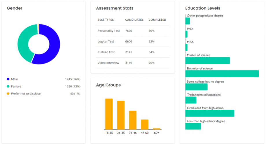
Dashboards are the navigation systems of good organizations, or at least they ought to be. Every organization has built a bad dashboard at least once and even experts will not falter in fulfilling a request if the fee is high enough (see this excellent Reddit thread from dashboard builders). A good dashboard shows the discrepancies between good and bad and ideally allows you to explore the cause of a downturn. A good dashboard effectively maps your internal organization but also shows what’s happening externally so that you can benchmark and compare to a wider audience.
The Talent Data Labs suite comes with a flexible and dynamic dashboard but there’s no equivalent for the API users so here’s a quick guideline post for both users and non-users with dashboarding aspirations.
Step 1: Set up your input variables
The first step is always data. Let your KPIs drive your needs here. Make sure you have at least a good overview of gender-, education-, cultural background-, and age-segmented data available on your talent. After covering the demographic data mentioned before it is time for your independent variables (read our report for more information on independent variables).
Scientific journals have given us some consistently good predictors of organizational behavior (performance, churn, sick leave, etc.). It is recommended to start with a recruitment or assessment suite that creates exactly the data you want and need. Just make sure you can follow the data, and have it extractable and available. Anyone should be able to dump this data in a google sheet or excel at any point in time, preferably continuously. Make sure you are able to do this by actually doing so.
Step 2: Set up your output variables
Output variables (or dependent variables) are anything that relates to performance. This can imply actual sales, targets met, engagement but also absenteeism, and making referrals to the company. As these are a bit less continuous and typically best measured at regular intervals you are allowed to set up a manual data dump here. Ideally, whenever someone overperforms - based on your indicators - you automatically flag them as high performers.
Now connect this data to your input variables, please follow anonymization practices if your organization requires that. The simplest method would be to change all names and emails into a number or hexadecimal and then attach the dependent variables from the same numbers to their independent variables. You can do this with the Vlookup or Index/Match functions in google sheets.
Step 3: Funnel your data into a dashboard
If you have done the above steps correctly you should be able to use a free tool like google data studio or even stick within the same google sheet you already have and start mixing and matching some data already. Now it’s important that you have the right labels so that you can see the differences between your high-performers, your incoming candidates, and your leavers. You should also display trends in certain behavior and the overall performance of your diversity strategy.
To summarize, make sure you get all your information in one place like google sheets (or blend it directly in a software provider like Tableau). It’s really important to focus on extracting the independent and dependent variables here. For inspiration, you can play around with the Talent Data Labs suite for a bit if you want (for free) to see how that works in an isolated environment (just use the reference code DDTRIAL2022 when checking out).
We also provide services to help people integrate all of the talent data you may have into a custom dashboard. Feel free to reach out to us for support and questions.
We hope you enjoyed this post. Here are some free extra tips for a great - informative dashboard:
-
Focus on differences and gaps. For example, the gap between people applying and people being high-performers.
-
Have data on your applicants, employees, and leavers. Neglecting any of these categories further contributes to steering blindly.
-
Make your data time-based so you can see month on month or quarterly differences.
-
A good dashboard shows problems, a better dashboard shows opportunities.
-
Clickable is everything so you can follow and inspect the change.